CLEANIST
Home cleaning brand identity and packaging system (concept)
OPPORTUNITY.
The household cleaning category is often dominated by visual noise, harsh chemical cues, and exaggerated claims. Cleanist explored a different perspective by asking what a cleaning brand could look and feel like if it balanced the precision of science with the restorative qualities of nature.
IMPACT.
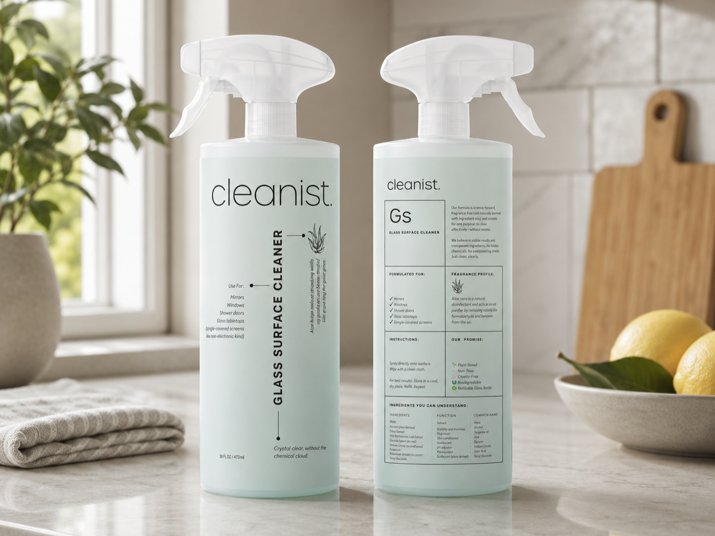
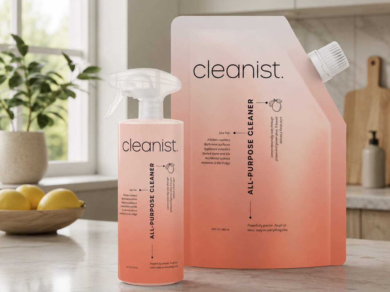
I developed the brand identity, packaging system, and visual language. The name Cleanist was inspired by scientific terminology, while the packaging borrows cues from laboratory labeling systems and the periodic table to present information with clarity and precision. Hand-drawn ingredient illustrations reference both botanical studies and technical scientific drawings, creating a visual language that feels analytical without losing warmth. Minimal typography and a restrained color palette reinforce the brand's calm, modern character.
ROLE.
Creative Direction · Brand Strategy · Brand Identity · Logo Design · Packaging Design · Product Line Architecture · Visual Identity System
Created while serving as VP, Creative Director at A-Frame Brands.